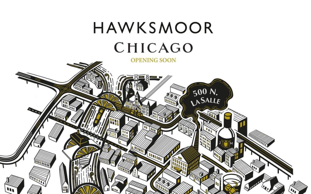
Menu cover Designs
Our menu covers are a little quirky and based on a map, dating back to 1898, called a Bird’s Eye View of the Business District of Chicago. It’s the first depiction we could find of our building, 500 N LaSalle Drive. Our co-founder Huw loves a good map.
Besides being fun to look at, he maintains they tell stories. To honor his passion, we like to create our own intricate maps of the cities where we build restaurants, drawing on local history.
The map on our cocktail menu is called a Skewed View After a Cocktail or Two. Because, well, things look more fun after a couple of good drinks, right? We turned Chicago into a cocktail city scape, including the Navy Pier Ferris Wheel turning in to a cocktail umbrella, lemon wedges bridging the Chicago River and a host of other cocktail elements hidden amongst the streets plus of course our building and the cable car route powered by our Powerhouse.
On our dessert menu, the city of Chicago becomes a giant dessert-scape with an L Train smashing out of it. Featuring iconic architecture from Chicago’s cityscape, we’ve named this one “Riding the L through sweet sweet home Chicago”, a nod to the Blues Brothers classic.
The wine menu is inspired by the giant cog pulling cable cars through the tunnel and draws on industrial heritage of the building with a dash of mechanical gadget king, Rube Goldberg. It illustrates the process of wine making, but instead of barrels or vats, pressed grapes are aged in the Great Lakes and then tapped to fill up wine bottles. The resulting wine? “Chateauneuf-du-Great-Lakes, Domaine de LaSalle Street Power House, Premier Grand Cru Classe, 1887”.